In the crowded world of telcos, where competitors spring up like mushrooms after a rainstorm, My Vodafone made a dramatic shift—from a humble account management tool to the digital heartbeat of Vodafone’s strategy.
As Lead Product Designer, I took the wheel, navigating the app through rough seas of technical debt, tight deadlines, and cross-departmental chaos. The result? A 67% overachievement in our call reduction target, an 84% increase in app penetration, and a 16% spike in digital revenue. Not too shabby, right?
Numbers First
App Penetration: From 38% → 70%
Call Reduction: -64%
Revenue Growth: From 1.8% to 16%
NPS Score: From 10 to 60
App Store Rating: From 2.5 to 4.3 stars
Context & Opportunity
The Challenge
Vodafone faced fierce competition from mobile virtual network operators (MVNOs), and it needed to stand out, cut costs, and improve customer engagement. My Vodafone, with a healthy 45M users across 14 markets, was more "utility tool" than "business-driving platform."
The mission was clear: Turn My Vodafone from a necessary evil (you know, the one you use just to pay your bill) into the go-to digital destination for customer interactions—from billing to sales, and everything in between.
Business Constraints
Of course, nothing is ever easy:
🚧 Technical debt: The app was built on a legacy infrastructure that made fast changes feel like turning the Titanic.
🚧 Tight deadlines: We had to squeeze this transformation into an already packed annual product roadmap. Think of it as a sprint… in a marathon.
🚧 Cross-team dependencies: Aligning Marketing, IT, and Customer Support was a bit like herding cats, but hey, that’s how real transformation happens.
Strategic Approach
Aligning Business & Design Goals
We built the new My Vodafone app on three core pillars:
Increase revenue: Because who doesn’t love a little extra cash? We enhanced e-commerce features and added commercial opportunities.
Enhance customer satisfaction: No more "what's my bill?" moments. We made billing clearer and service more personalized.
Reduce operational costs: We deployed TOBi, our AI chatbot, to answer questions, reduce call center volume, and give people more reasons to love self-service.

Collaborative Execution
We didn’t just work in silos. Nope. We brought all the key players to the table:
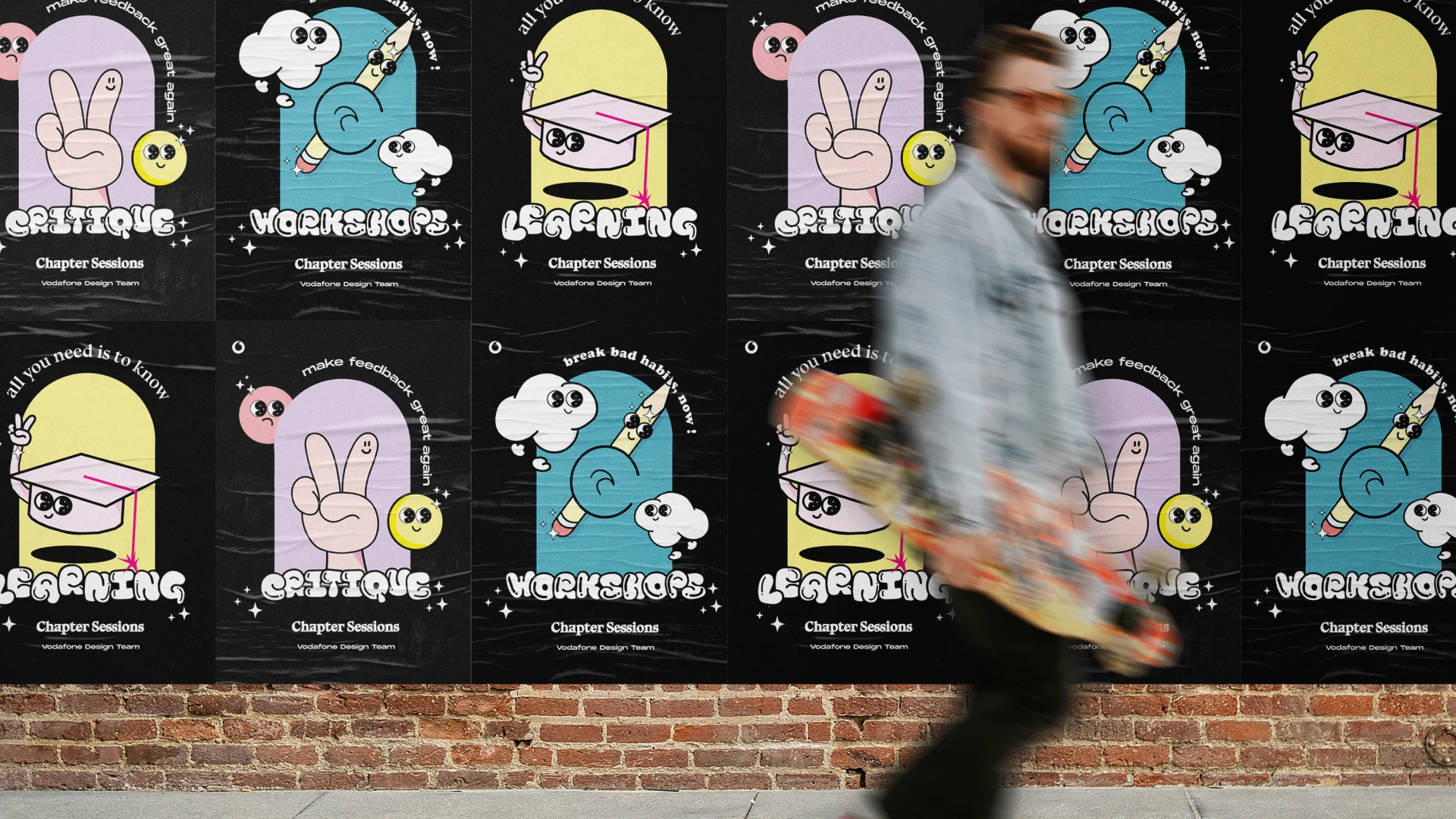
🚀 Workshops with stakeholders: Marketing, IT, Customer Support—you name it. We made sure everyone was on the same page (and the same slide deck).
🚀 Collaboration with engineering: From day one, we worked closely with engineering to make sure our dreams were technically feasible.
🚀 Feedback loops: With customer research teams on board, we fine-tuned our design every step of the way.
Design Strategy
Defining a Unified Experience
We set clear Design Principles to guide us:
✔ Know before I know: Anticipate user needs before they even ask.
✔ Make it personal: Leverage data to offer tailor-made experiences (we’re talking Netflix-style recommendations, but for your mobile bill).
✔ Always ready to help: TOBi, our AI chatbot, was there 24/7, ready to tackle questions before they even became problems.
✔ Celebrate small things: A delightful micro-interaction here, a visual feedback there—little touches that make the experience feel more like a conversation than a transaction.
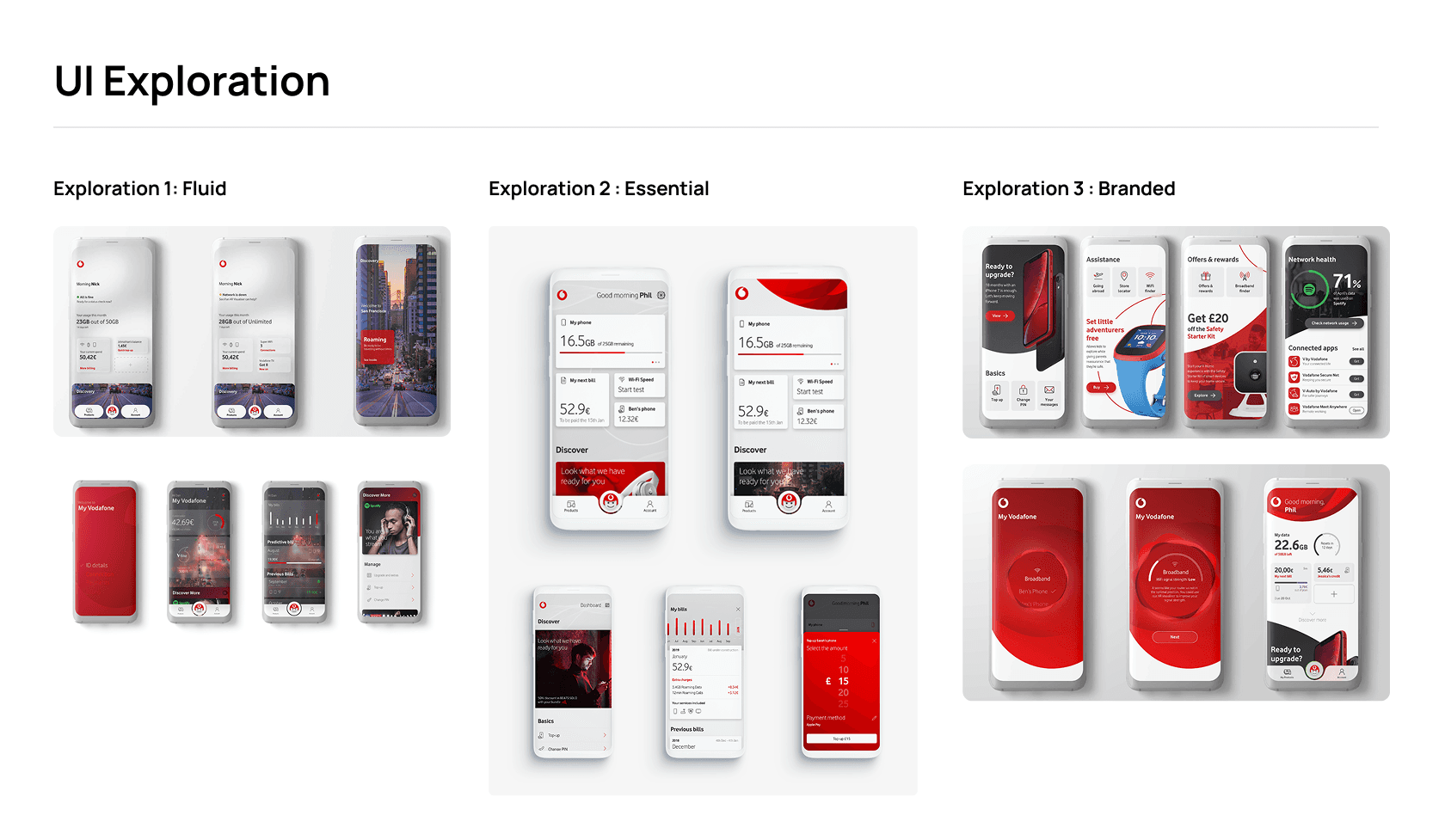
Interaction Models & Information Architecture
We played around with several interaction models and fine-tuned them until they were just right:
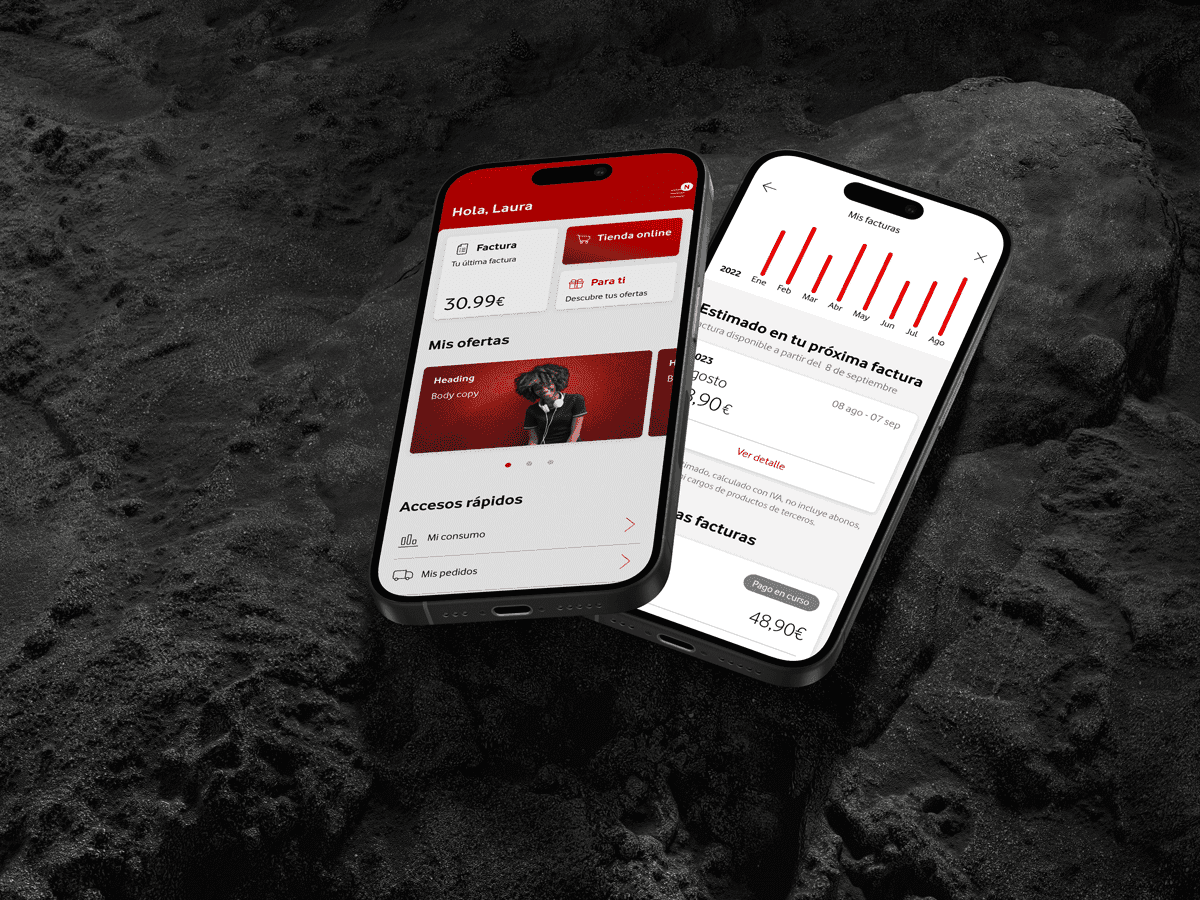
📌 Dynamic Dashboard: Personalized widgets that adjusted based on user behavior (because who has time to dig through menus?).
📌 Engagement Hooks: Smart notifications that nudged users toward the next step (no one likes a boring app).
📌 TOBi Concierge: An AI-powered chatbot that was integrated into customer journeys. It wasn't just a robot; it was your personal app assistant.
🔍 A/B Testing Results: We ran tests on multiple layouts and features. Spoiler alert: The Dynamic Dashboard + TOBi combo drove up user retention and conversions in a big way.

Implementation & Development
Validation & User Testing
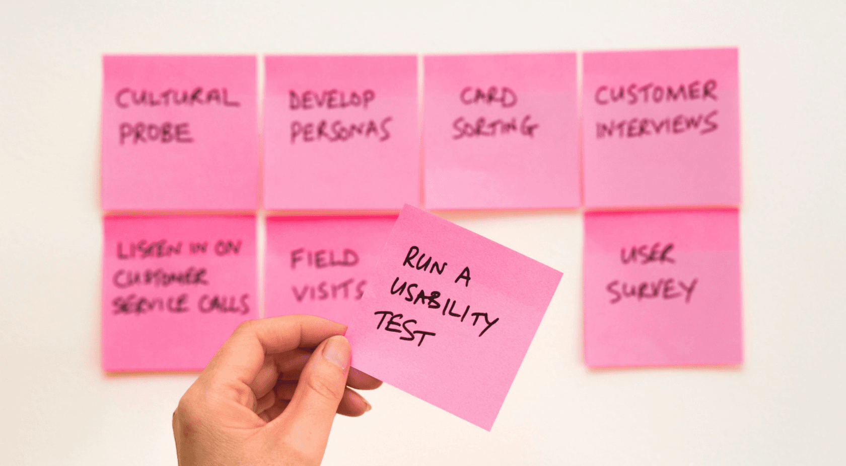
We didn’t just guess what users wanted—we tested it:
Usability testing: From onboarding flows to chatbot interactions, we made sure everything clicked.
A/B testing: We compared different dashboard layouts and engagement strategies.
Data analytics: We kept an eye on key KPIs like app penetration, revenue growth, and call center volume reduction.
Phased Rollout Strategy
We didn’t just throw everything into the market at once. Instead, we:
📍 Quick Wins: Delivered immediate UI improvements and enhanced navigation.
📍 Beta Release: Soft-launched in select markets for real-world feedback.
📍 Global Rollout: Gradual expansion across all 14 markets, with continuous optimization post-launch.


Results & Business Impact
Key Metrics
📈 App Penetration: 38% → 70%. That's a lot more people using the app to do more than just check their balance.
📉 Call Reduction: -64% thanks to TOBi and improved self-service options. Looks like TOBi was the real MVP.
💰 Revenue Growth: Digital channel sales shot up from 1.8% to 16%. Who knew an app could be so profitable?
⭐ NPS Score: Jumped from 10 to 60. If that’s not customer love, I don’t know what is.
📱 App Store Rating: Improved from 2.5 to 4.3 stars. Sometimes, all it takes is a little TLC.
Challenges Overcome
⚡ Balancing speed vs. stability: We didn’t just rush to launch; we made sure everything worked smoothly (though we still had some "oh no!" moments).
⚡ Cross-team alignment: Weekly syncs between design and engineering made sure no one got lost in the shuffle.
⚡ Data-driven decision-making: We combined user research with data to ensure every design decision had measurable impact.
Key Learnings & Future Improvements
Lessons Learned
📌 Products must evolve: We tweaked the initial designs based on real-time feedback. Design is a living, breathing thing.
📌 Data-driven design is crucial: Using both qualitative and quantitative insights made a real difference.
📌 Collaboration is key: Strong partnerships between design, product, and engineering were the secret sauce to success.
Future Iterations
🔮 Optimizing Discovery Section: We’re simplifying navigation to drive even more conversions.
🔮 AI-Powered Personalization: We're enhancing recommendations using machine learning.
🔮 New Service Integrations: IoT and digital payments are next on the list to make the app even more engaging.
Final Thoughts
The transformation of My Vodafone wasn’t just about slapping a new coat of paint on an old app—it was about redefining how users engage with the entire telco ecosystem. By aligning business goals with design, iterating based on real feedback, and using data to drive decisions, we were able to deliver tangible business outcomes.
So, yes—design isn’t just about looking pretty. It’s a key driver of business success. 🚀